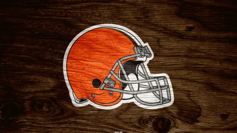
For weeks the Cleveland Browns have hyped up their new logo like any football franchise would. The only problem? When the Cleveland Browns new logo was released on Tuesday, it was an extreme disappointment.
Why? Because nothing has changed.
While many were expecting a completely revamped look the Cleveland Browns new logo was nothing more than an updated Dawg Pound graphic and a deeper shade of orange. Yes, the big change was a shade of color.
Changes to the Cleveland Browns color & Dawg Pound logo pic.twitter.com/1O8YE2F5Ri
— Darren Rovell (@darrenrovell) February 24, 2015
There may or may not still be a few subtle changes coming to the Cleveland Browns uniform, but really? This is what all the excitement and hype was about? A color change to the football helmet? I’d make a joke suggesting only the Cleveland Browns would do something like this, but well…
The funny thing is, the new deeper orange color actually looks better and is a nice change but there was little need to make it sound as if the Browns were going to change their look.


